Overview
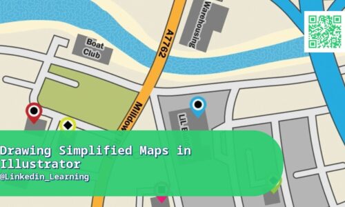
An overly detailed map often communicates less than a clean, simplified one — think transit maps, event venue guides, or route diagrams where clarity at a glance matters more than geographic precision. This course covers using Adobe Illustrator to design exactly that kind of simplified map, focusing on the design decisions that make a map genuinely readable — deciding what to include and, more importantly, what to deliberately leave out, using color and line weight to establish visual hierarchy, and labeling clearly without cluttering the design. It’s a practical, tool-specific skill rather than a full cartography course. It also touches on adapting a single map design across multiple output formats, from print materials to digital screens. The course also covers a decision every map design involves: choosing a level of simplification that matches the map’s actual purpose, since a transit map needs almost no geographic accuracy at all (it just needs to show connections clearly), while an event venue map needs to preserve enough real spatial relationships that attendees don’t get genuinely lost. You’ll also cover building maps that stay legible when printed small, since many simplified maps end up on a folded event program or a small signage panel rather than displayed at full size.
Real-World Relevance & Use Cases
Simplified, custom maps show up constantly in real design work: event programs, wayfinding signage, real estate marketing, travel guides, and editorial illustration all regularly call for a clean map that a generic Google Maps screenshot can’t provide. Designers who can produce these confidently have a genuinely marketable niche skill that comes up often enough to be worth having, without requiring the much deeper investment of learning full GIS or cartography software. This is directly useful for freelance and in-house graphic designers who want to expand the range of client requests they can say yes to. It also saves client budget compared to commissioning a separate specialist cartographer for what’s often a fairly contained design task. This matters directly for an event planning client who needs a venue map that fits on a single printed program page but still helps hundreds of attendees find specific rooms without confusion. It’s also relevant for a real estate marketing project needing a neighborhood map that highlights nearby amenities clearly, where geographic precision matters far less than making a property feel appealingly located.
Who This Course Is For
For graphic designers who already know Illustrator’s basics and want to add simplified map design to their skill set — useful for freelancers taking on event, real estate, or editorial design work, and in-house designers who occasionally get map-related requests. It’s also useful for marketing and events teams that need custom maps regularly and want an in-house designer able to produce them quickly instead of outsourcing every request. Wayfinding and signage designers will find the visual hierarchy principles taught here transfer directly into related spatial design work. It’s a focused, practical investment for designers who want one more genuinely billable skill in their toolkit. It’s also relevant for in-house designers at companies that host recurring events, who need a repeatable map template rather than starting from scratch for every single event.
What You’ll Learn
- What makes a simplified map effective (and what to leave out)
- Setting up an Illustrator file for map design
- Establishing visual hierarchy with color and line weight
- Drawing clean, simplified routes and boundaries
- Adding clear labels without cluttering the design
- Designing map icons and legends
- Adapting a map for different output sizes and formats
- Common mistakes that make maps harder to read
- Project: designing a simplified map from a real location
Course Files
Instructor